GRÆS Magazine Issue Two – Dialect
My Role
Publisher
Designer
Summary
I planned, designed, and published issue two of GRÆS Magazine
Details
A month after the release of GRÆS: issue one, I began brainstorming on the theme of issue 2. My goal was to publish it in early 2020.
Two weeks and many lists later, the theme Dialect was chosen.
I contacted multiple potential contributors including :
- two published authors, whose books I had previously read (Erin Moore, Gaston Dorren)
- one comic artist (Malachi Ray Rempen, creator of Itchy Feet)
Thankfully, all of these people agreed to contribute to the magazine. The remaining contributors either reached out to my open call on GRÆS’ social media channels or applied to my job posting on Upwork.com.
The entire magazine was designed in Adobe Indesign on my laptop while I traveled through Japan, Italy, the United States, Ireland, England and more countries. I collected photography and texts on some of these trips .
For this issue, I decided to switch printers for budget reasons. Issue one cost more than it should have and was definitely a learning experience. After talking to various printers in Spain, Lithuania, Latvia, and Germany, I decided on Jelgavas Tipografija in Latvia.
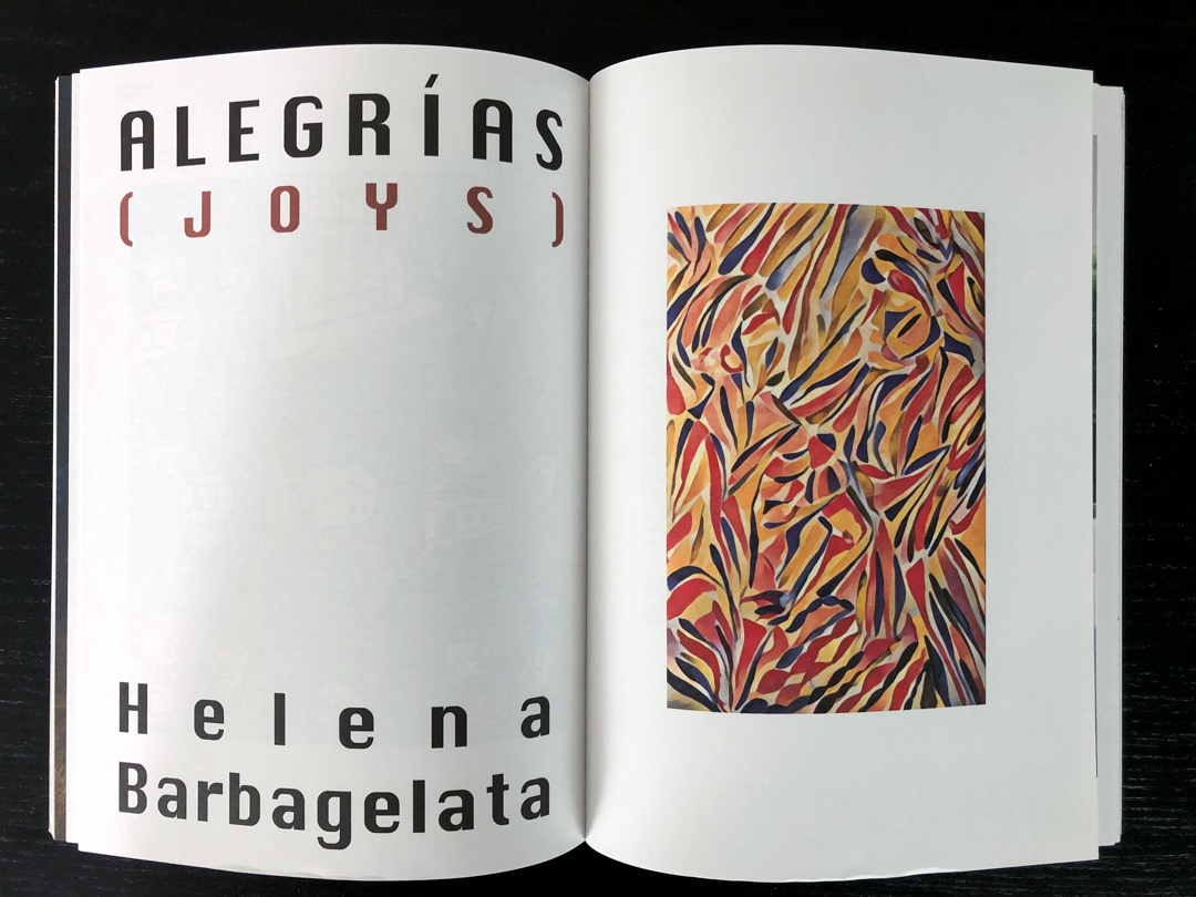
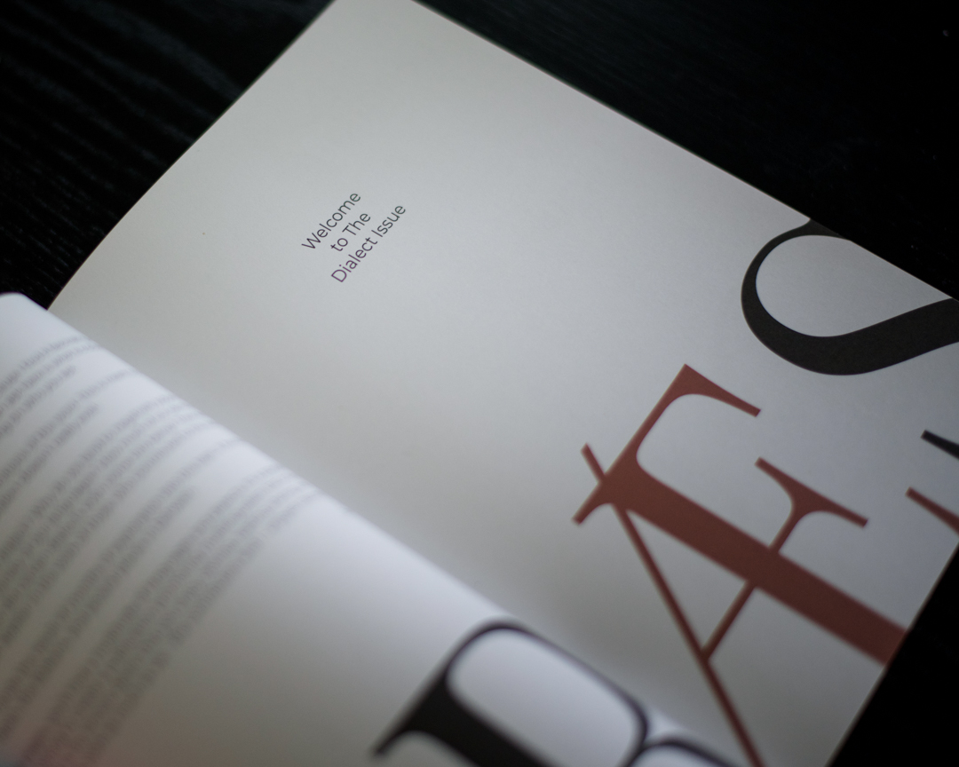
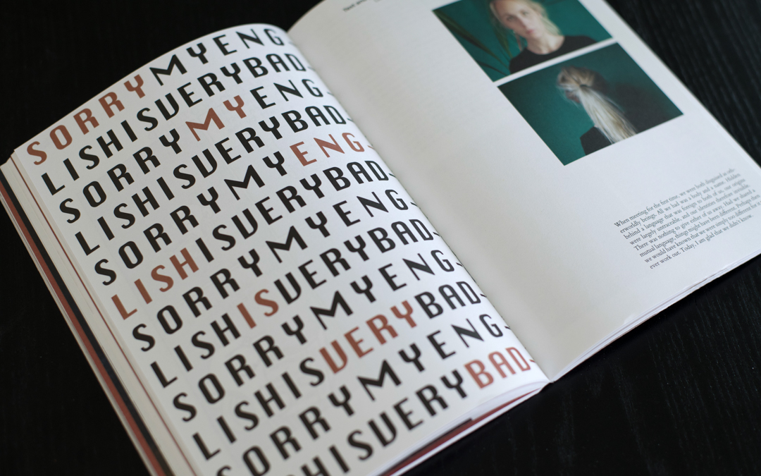
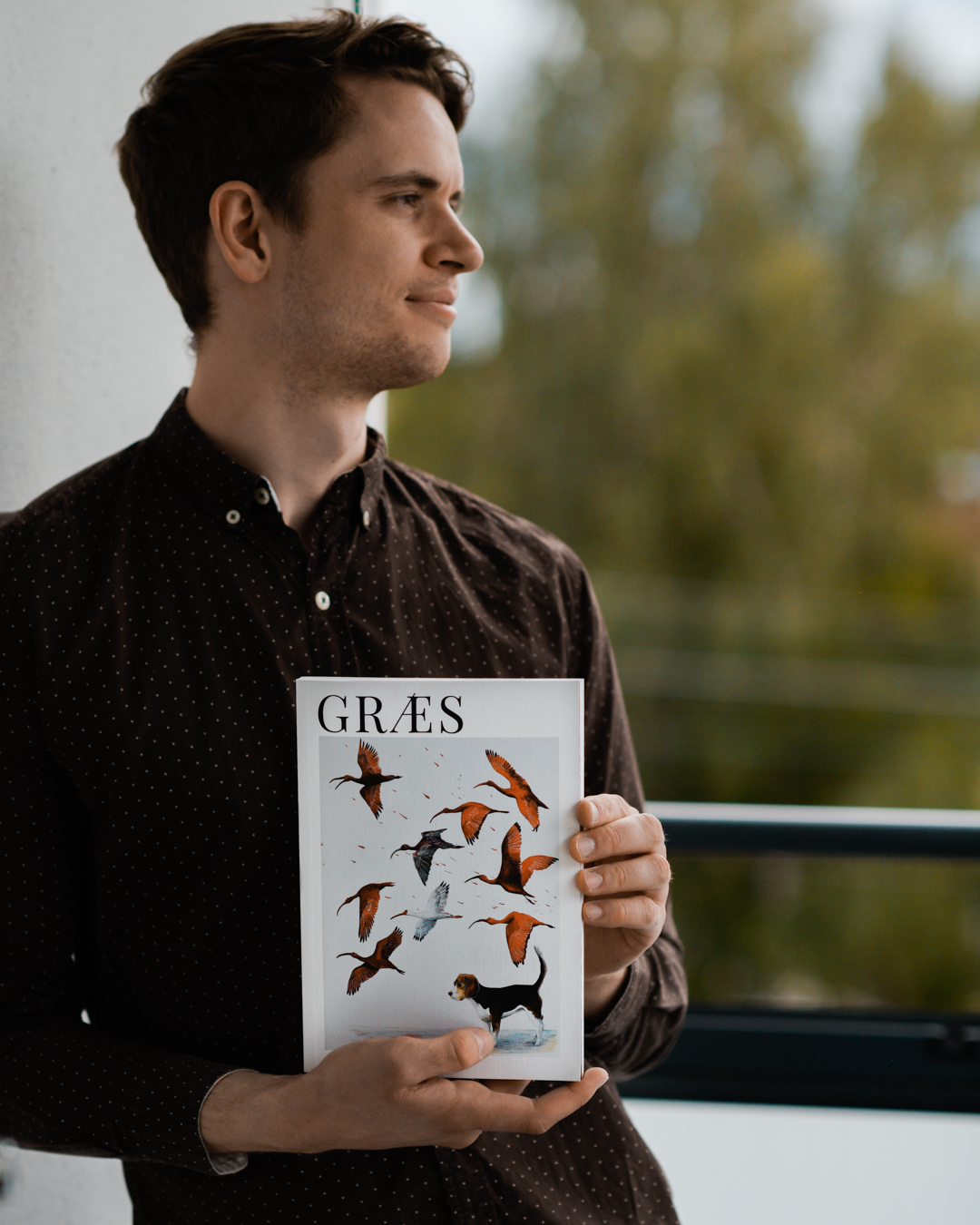
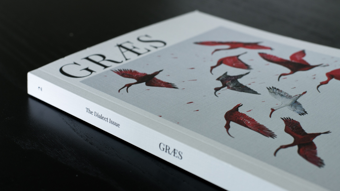
The final product is a 156-page publication featuring 12 contributions from international authors and artists as well as 3 interviews all focusing on Dialect. It’s 17x24cm in size and printed using high-quality offset printing.
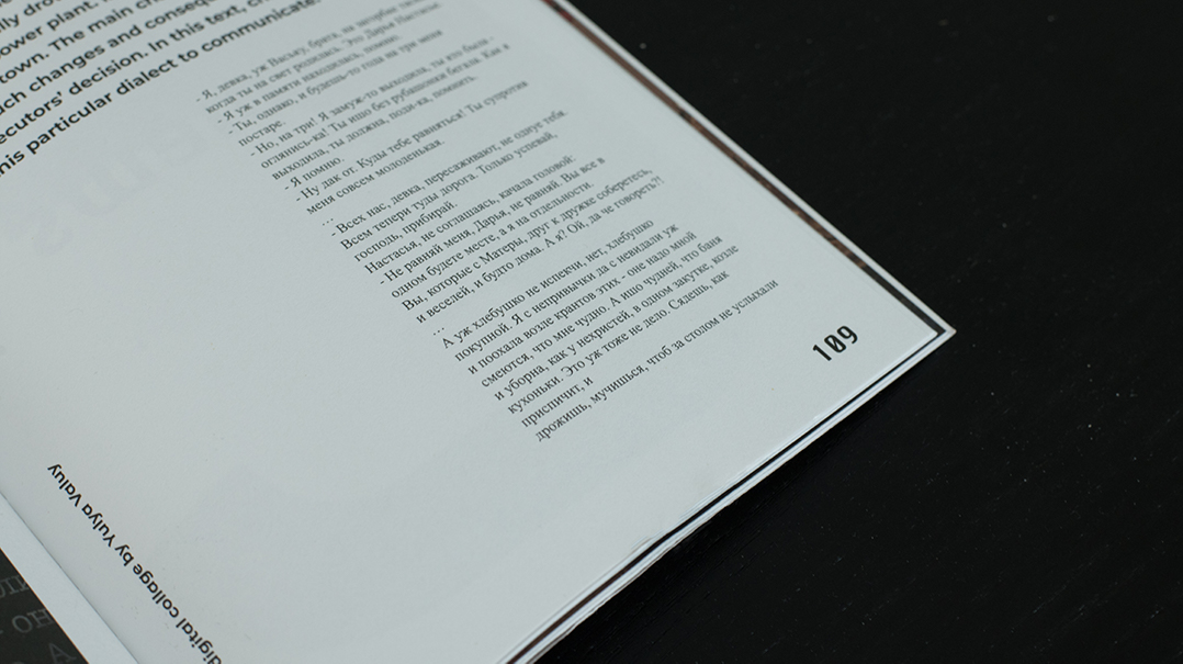
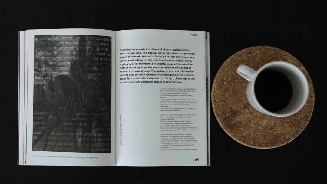
What separates a language from a dialect? Why do we tend to negatively judge those who don‘t conform to the standard variety of our languages? How tightly are our identities and emotions tied to the dialect(s) we speak? How did certain dialects even come into being? These are just a few of the questions that appear in the work of those who contributed to this issue. Within these pages, you’ll find texts written in a multitude of languages and dialects. It’s a little polyglot heaven.
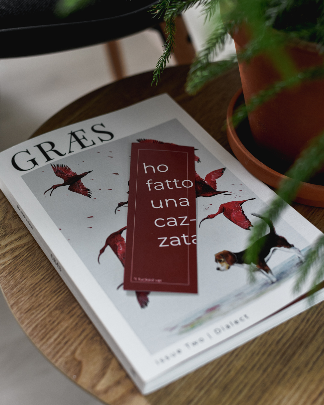
A week or so after sending the files to the printer, I realized that there were some minor typos in an Italian-English interview. It was too late to correct this flaw so I designed and printed bookmarks with 'ho fatto una cazzata' written on them. This is a common Italian phrase that translates to 'I fucked up'. The phrase is purposefully misaligned and the words run partly off the paper. This design is a reminder (and a celebration) of the fact that we all make mistakes, but there is always a solution and we can still move forward.
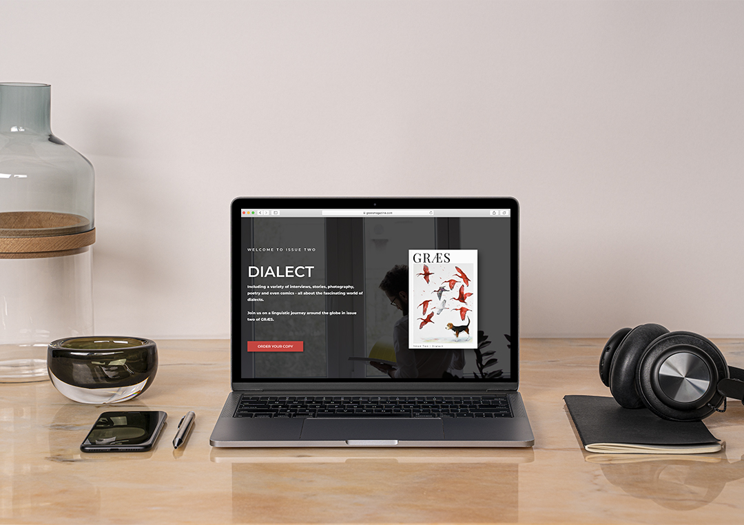
The above image is the top of a landing page I created for this issue. Scrolling down reveals a list of the 'chapters' within the book, 3 noteworthy contributors, and photographs of selected spreads as a preview for the reader.

